
Crafting Local Pride: Beer Label Designs for Tooth and Nail Brewing Co.


This product design project focused on creating two beer can label designs for a new craft beer line from Tooth and Nail Brewing Company. The objective was to design two distinct labels and titles that celebrate Ottawa, Ontario’s local pride by highlighting things the city is famous for, while maintaining a cohesive visual connection to the Tooth and Nail brand. The final deliverables included high-quality mockups, and a production-ready dieline for printing. The project was completed using Adobe Illustrator, and Photoshop to ensure professional quality and presentation across both digital and print applications.
The Challenge
The challenge of this project was to design a beer can label and name inspired by something that Ottawa is famous for, while avoiding concepts that felt too obvious, overused, or cliché. The goal was to strike a balance between local identity and creative originality, capturing the spirit of Ottawa in a way that felt fresh, authentic, and aligned with Tooth and Nail Brewing Company’s bold and distinctive brand personality. The final design needed to stand out visually on the shelf, appeal to both locals and visitors, and communicate a sense of place without relying on predictable symbols or imagery.
The Process
Research
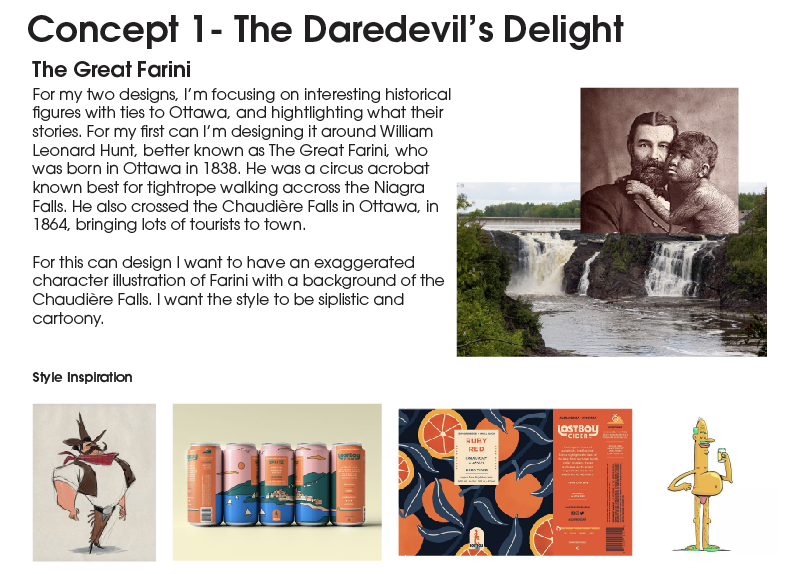
The research phase of this project began with an in-depth exploration of Tooth and Nail Brewing Company’s brand identity, history, and clientele to understand the tone, aesthetic, and values that define their products. I analyzed their existing beer can label designs and offerings, noting common design elements, colour schemes, and typography choices that contribute to their bold yet refined brand image. Next, I researched Ottawa’s cultural identity and iconic associations to find inspiration that would authentically represent the city without being overly literal. This led to the concept of basing each label on influential figures born in Ottawa, ultimately selecting The Great Farini and Big Joe Mufferaw as muses for their legendary stories and ties to the city. I studied their most notable achievements and personal histories, identifying visual motifs and narrative elements to incorporate into each design. Finally, I brainstormed beer names that reflected both the personality of each concept and the artistic tone of the Tooth and Nail brand.
Ideation
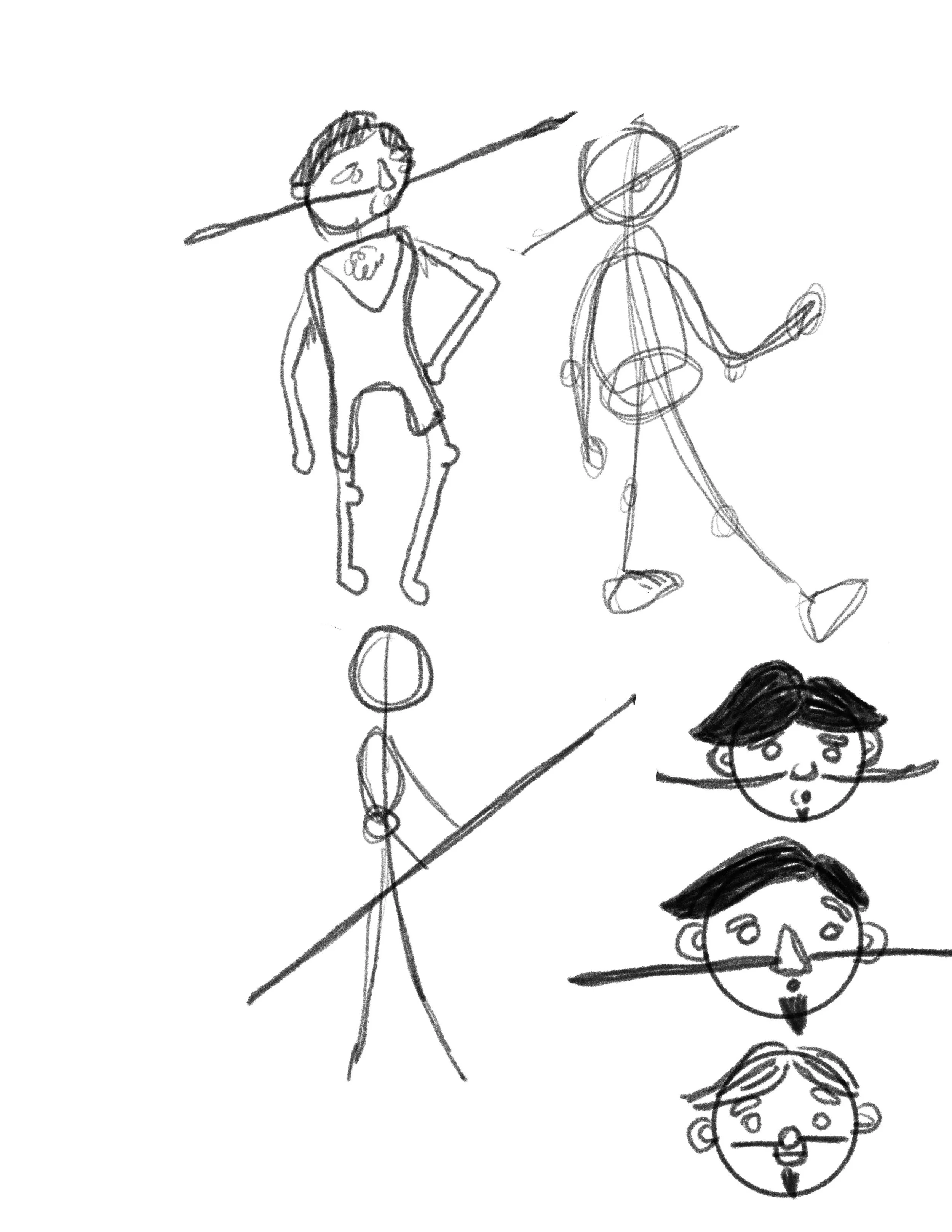
During the ideation phase, I created multiple character sketches of the two Ottawa figures, experimenting with different illustration styles, proportions, and poses to capture their personalities in a playful, approachable way. From there, I explored several label compositions, testing how the characters interacted with typography, background elements, and key information. I rearranged layouts, adjusted hierarchy, and tried various visual balances to find a structure that felt engaging, readable, and true to each character’s story.
Execution
In the execution phase, I began by setting up precise dielines in Adobe Illustrator, ensuring that all measurements, folds, and bleed areas were accurate for print production. I then vectorized my final label designs directly onto these dielines, refining colour, typography, and alignment to create clean, scalable artwork ready for production. Once the labels were finalized, I imported them into Adobe Photoshop to create realistic mockups, allowing me to visualize how the designs would appear on the actual cans and in promotional contexts.
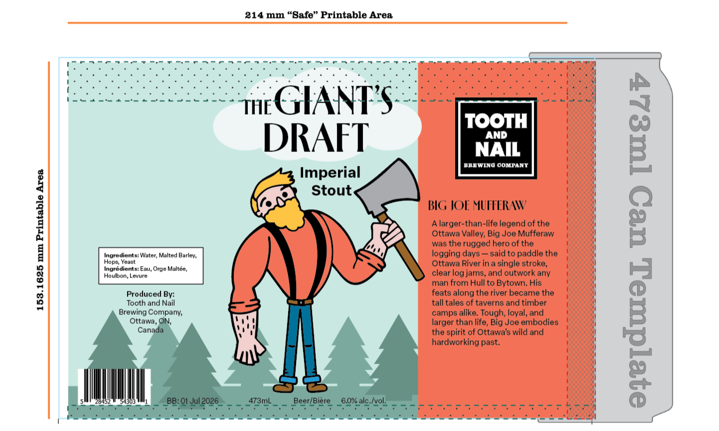
The Result
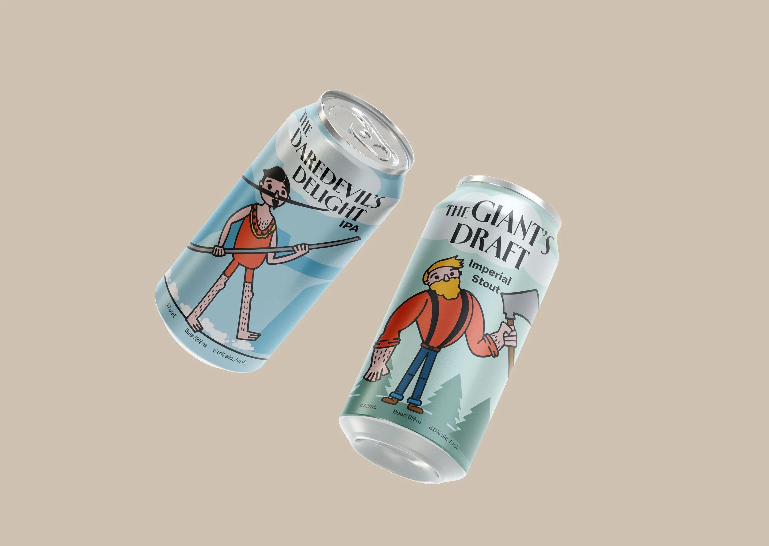
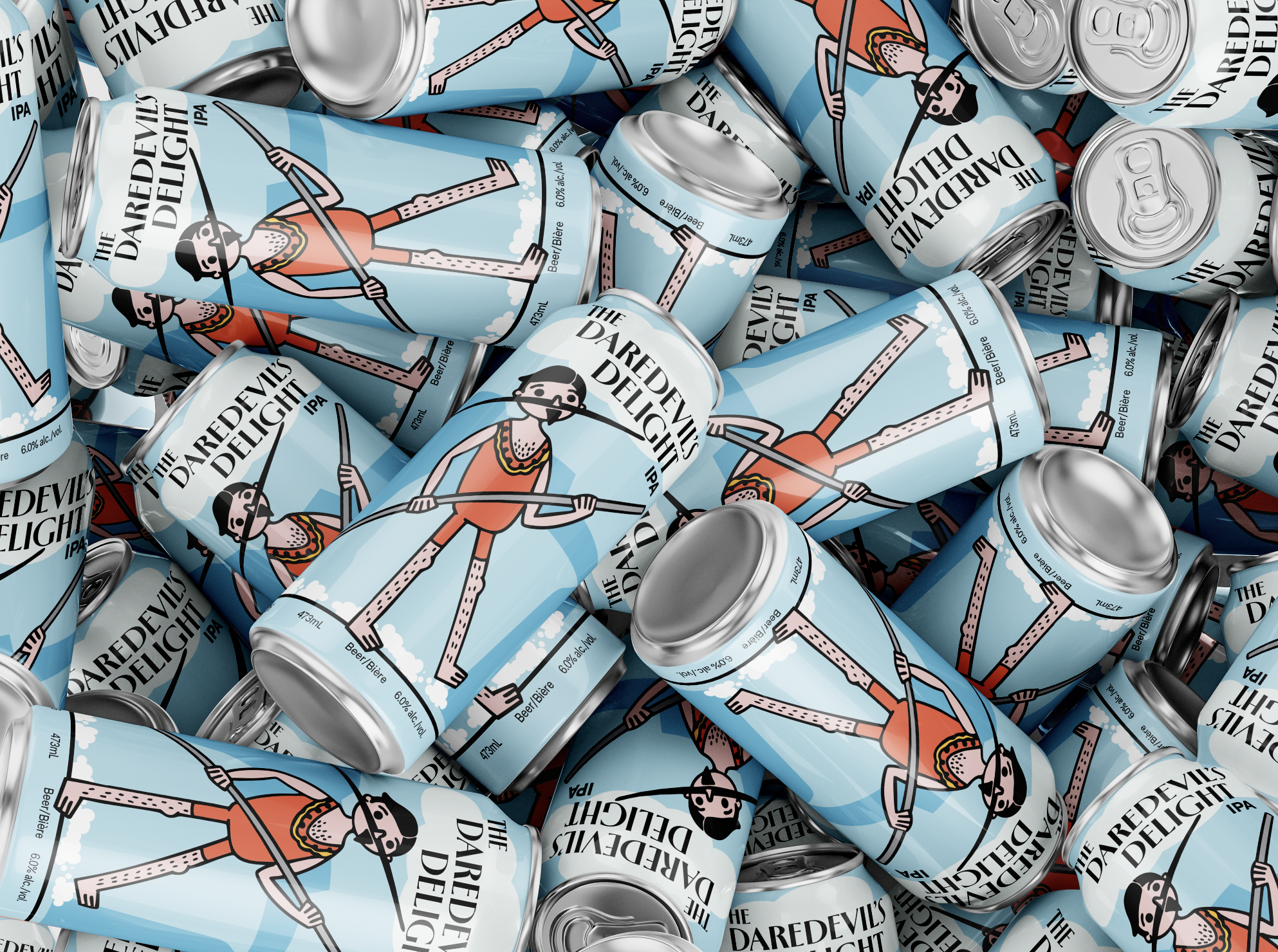
The finalized beer can designs bring both Ottawa legends to life through bold, character-driven illustrations and clear, engaging label layouts. Each can features a distinct figure — Big Joe Mufferaw and The Great Farini — rendered in a playful, stylized approach that reflects the larger-than-life stories they’re known for. Their poses, expressions, and signature traits were refined from earlier sketches to create characters that feel lively, memorable, and instantly recognizable on the shelf.
The layouts balance illustration, typography, and key product information in a way that remains clean, readable, and visually dynamic. Background scenery and subtle graphic elements help set the scene for each character without overwhelming the design. The colour palettes were chosen to differentiate the beers while maintaining a cohesive series style, allowing the cans to stand alone or work together as a unified set. The included images showcase the final results, emphasizing the personality, storytelling, and visual clarity achieved in the finished labels.
