Reviving the Wild: A Fresh Brand Identity for Holly’s Haven Wildlife Rescue

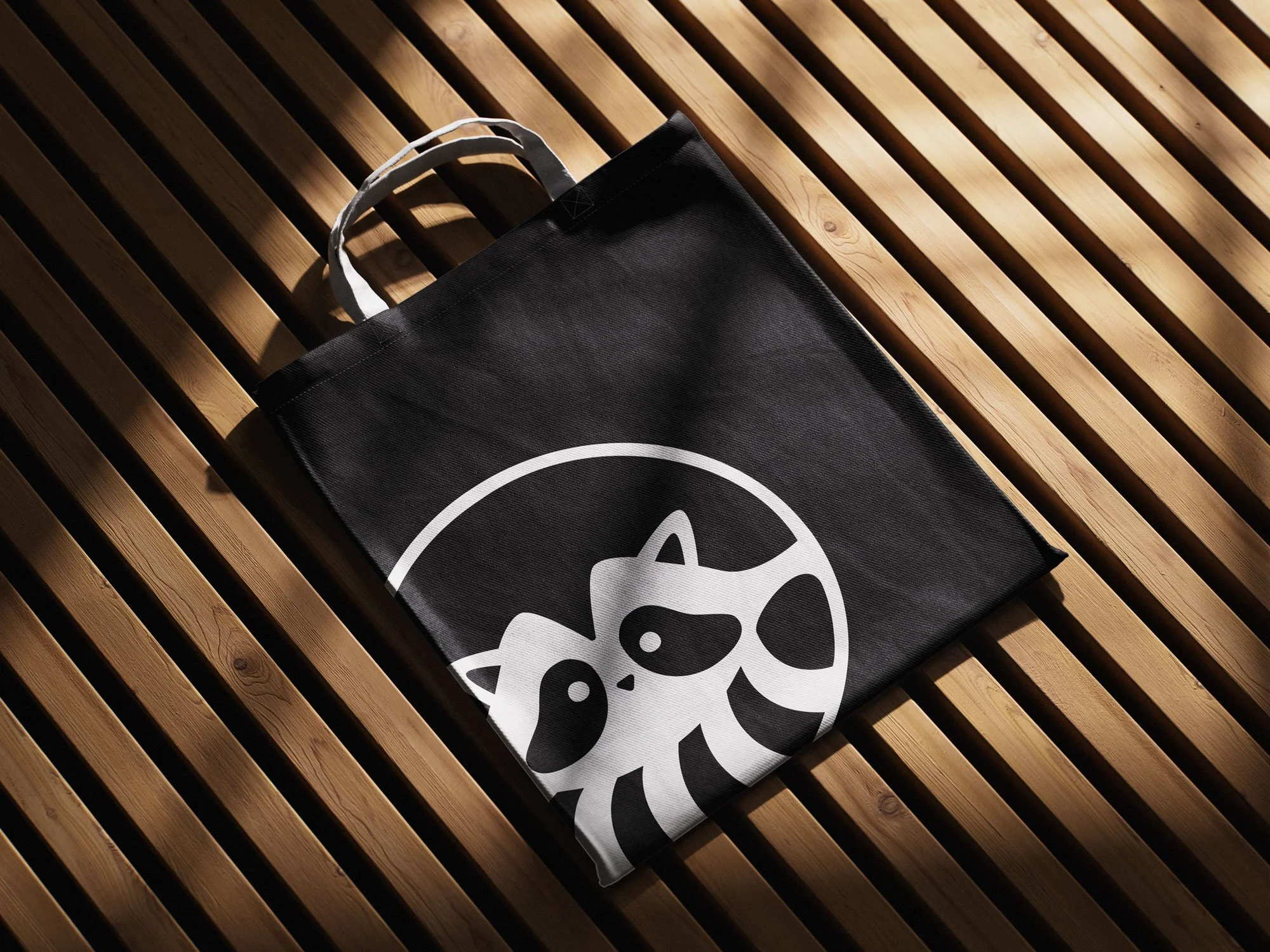
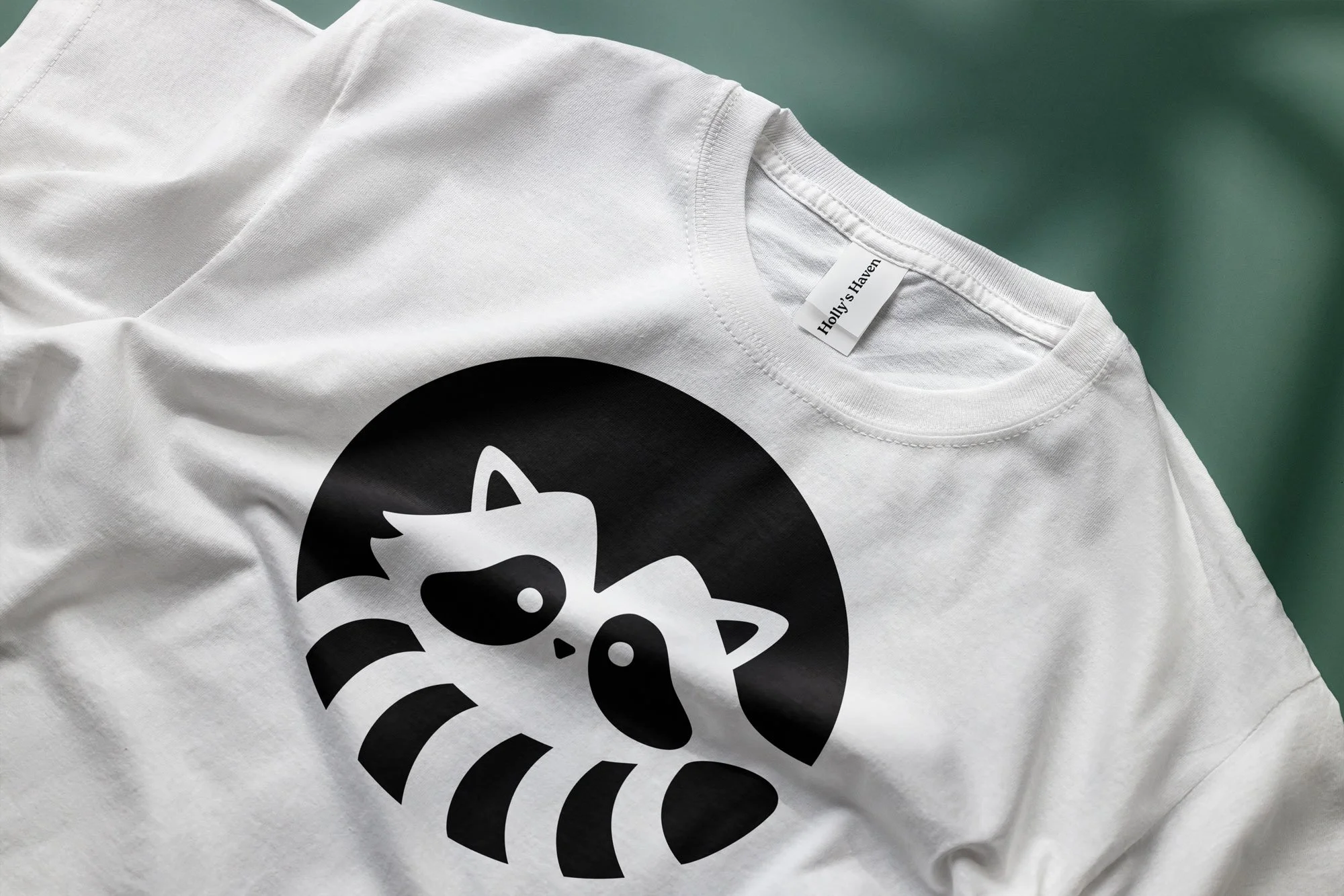

This branding project focused on redesigning the logo for Holly’s Haven Wildlife Rescue to create a versatile, recognizable, and cohesive visual identity that works seamlessly across all mediums and sizes. The goal was to develop a logo that truly represents the organization’s mission while maintaining clarity and adaptability in various formats, including black and white, reversed, coloured, and reduced versions. In addition to the logo, I designed a complete stationery package—featuring a letterhead, business card, and envelope—that incorporates the new branding elements. The final deliverables included both print-ready PDF files and Adobe Illustrator working files. To ensure consistent and effective use of the new identity, I also created a comprehensive branding guide in PDF format outlining proper logo usage, placement, and visual standards. The project was completed using Adobe Illustrator and Adobe Acrobat.
The Challenge
The existing Holly’s Haven Wildlife Rescue logo lacked adaptability and did not effectively communicate the organization’s values or mission. The brand needed a scalable logo system that could maintain its integrity across digital and print platforms.
The Process
Research and Concept Development
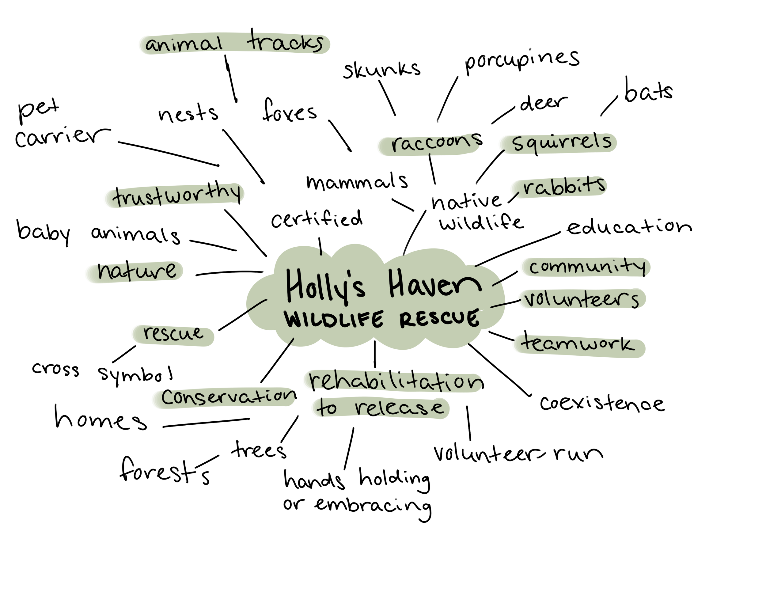
The design process began with in-depth research into Holly’s Haven Wildlife Rescue’s mission, values, and visual identity, as well as an analysis of competing wildlife organizations and their logos. This helped establish an understanding of industry standards and opportunities for differentiation. I created a comprehensive creative brief outlining the target audience, project goals, key message, desired perception, tone, and creative considerations. From there, I developed a mind map to explore potential visual elements and symbols that could represent the organization’s compassion for wildlife. To solidify the aesthetic direction, I curated a moodboard featuring imagery, textures, and colour palettes that reflected the organization’s caring and natural essence.
Sketching and Concept Refinement
The next stage involved two rounds of sketching to explore and refine ideas. In the first round, I created 30 preliminary sketches, experimenting with different shapes, imagery, and compositions inspired by the mind map and moodboard. After gathering feedback, I selected the two strongest concepts and developed 10 refined sketches for each, focusing on improving balance, symbolism, and scalability. This iterative process ensured that the chosen concepts aligned with both the organization’s identity and practical design requirements.
Digitization and Finalization
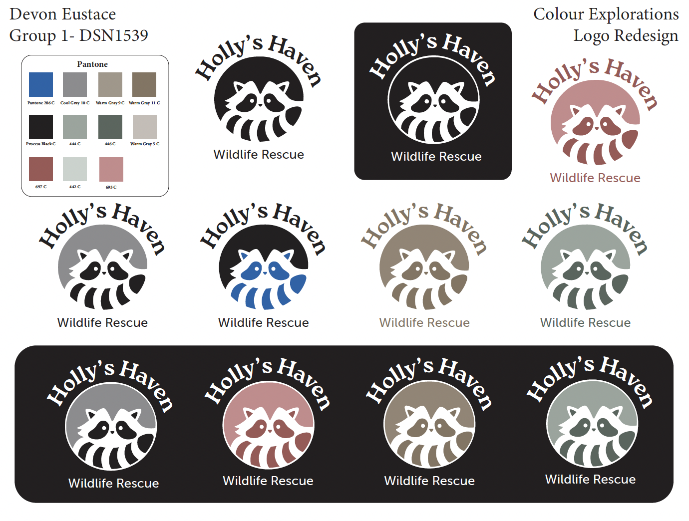
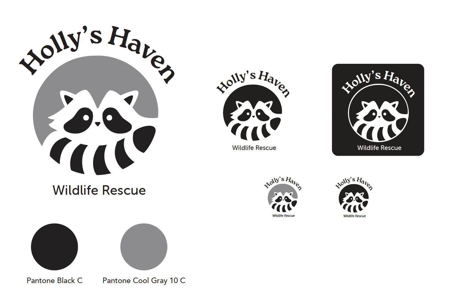
With the top concepts selected, I moved into the execution phase, digitizing the two preferred logo designs in Adobe Illustrator. I created 10 vector variations of each, exploring typography pairings, layouts, and design refinements to ensure versatility and visual harmony. After evaluating these versions, I finalized the strongest design and experimented with colour applications to find the most effective palette. The completed logo system included full-colour, black and white, reversed-out, and reduced versions, each optimized for consistent use across digital and print formats.
The Result
The final logo design for Holly’s Haven Wildlife Rescue successfully captures the heart of the organization while addressing the initial design challenge of creating a versatile, recognizable, and meaningful visual identity. The central raccoon icon was chosen because the raccoon is one of the primary animals rescued by Holly’s Haven, making it a direct and authentic representation of the organization’s mission. The raccoon’s curled, circular posture symbolizes comfort, safety, and care — reflecting the refuge and compassion that Holly’s Haven provides to injured and orphaned wildlife.
The simplified, vectorized design ensures that the logo maintains clarity and legibility across all mediums and scales, from small digital icons to large signage. The black and grey colour palette reinforces recognition by mirroring the raccoon’s natural markings, while also providing strong contrast and adaptability for both print and digital use. Clean, professional typography complements the icon, ensuring the brand name is easy to read at any size and aligns with the organization’s credible and trustworthy image. Visual hierarchy is established through text size and weight, emphasizing “Holly’s Haven” first and positioning the supporting text as a clear descriptor.

